We spend a lot of time fostering an inclusive space at TXI, but until recently, we hadn’t made a point of building accessible software. It’s something we all wanted to pursue from both a development and design perspective, because it pushes us to improve our craft and serves the disability community. A lot of us also have personal ties to people with disabilities and it’s frustrating to build things that people you love can’t use.
We have always dedicated a lot of time to making sure the products we design and build are intuitive for our end users — but we almost always assumed they were non-disabled people. In the technology industry, it’s an unfortunate truth that a large swath of potential users just get ignored. Learning how to build accessible software requires time, empathy and humility. When you’re rushing to launch a minimum viable product, it’s easy to write accessibility features off as edge cases. But think about that: People are not edge cases. People with disabilities deserve an accessible experience.
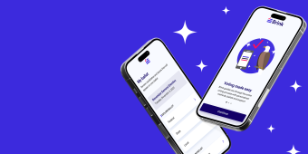
Brink knew that. Founded by former members of Hillary for America, the startup came to us wanting to develop an election app that would guide all voters through the voting process — with specific focus on those with disabilities. To meet that goal, we had to design an app that worked just as well for someone Blind or Deaf as for those who are sighted and hearing. Brink was giving us the time we always needed.
Now we just had to use it to build a product that works for everyone — and a system to make it easier to build accessible products going forward.
Note: To that end, we're planning to build a new Table XI website this year to address the inaccessible elements in this WordPress theme, including the lack of alt text on main images. We apologize that our content isn't as accessible as it should be right now.
Mapping out the requirements for accessible software design
The first step was to figure out what, exactly, makes an app accessible. Then we had to become comfortable enough with that work to turn accessibility into a repeatable process for building in the future
We didn’t want to stop after our project with Brink. Everything we do should be accessible, even if our clients aren’t explicitly asking for it. By familiarizing ourselves with the research and best practices— making sure to document it as we went, we could make accessibility a habit and core to how we build. If we setup the proper groundwork for accessible design every time, we could offer accessibility to all our clients at a minimal cost.
So, we set out to build a checklist that would account for every step we needed to take. It would help us bridge the gap until designing for accessibility just became part of our muscle memory.
Following software accessibility standards across platforms
Part of making mobile apps accessible is meeting people where they are, and that means including as much of the mobile market as you can. Supporting both iOS and Android can be an issue, however, because both platforms have their own accessibility guidelines.
We knew from the start that we were going to build the Brink app in React. We’ve basically gone all-in on learning React Native, precisely because it’s so perfect for building cross-platform apps. One codebase will produce native iOS and Android apps. It’s still not a two-for-one deal — you have to do plenty of tweaking to get each app to feel perfectly native — but it’s definitely better than writing two sets of code.
React Native also has a great set of instructions on how to make applications accessible, and it’s already working on solutions to take care of some of the discrepancies between iOS and Android. We were able to lean heavily on those tools while we created the Brink app, and we’ll be able to lean heavily on our code for the Brink app when we use React Native to build accessible cross-platform apps in the future.
Expanding our requirements for accessible software design
Our design team devotes so much energy to creating the easiest possible user experience already — we just needed them to think more broadly about who those users were.
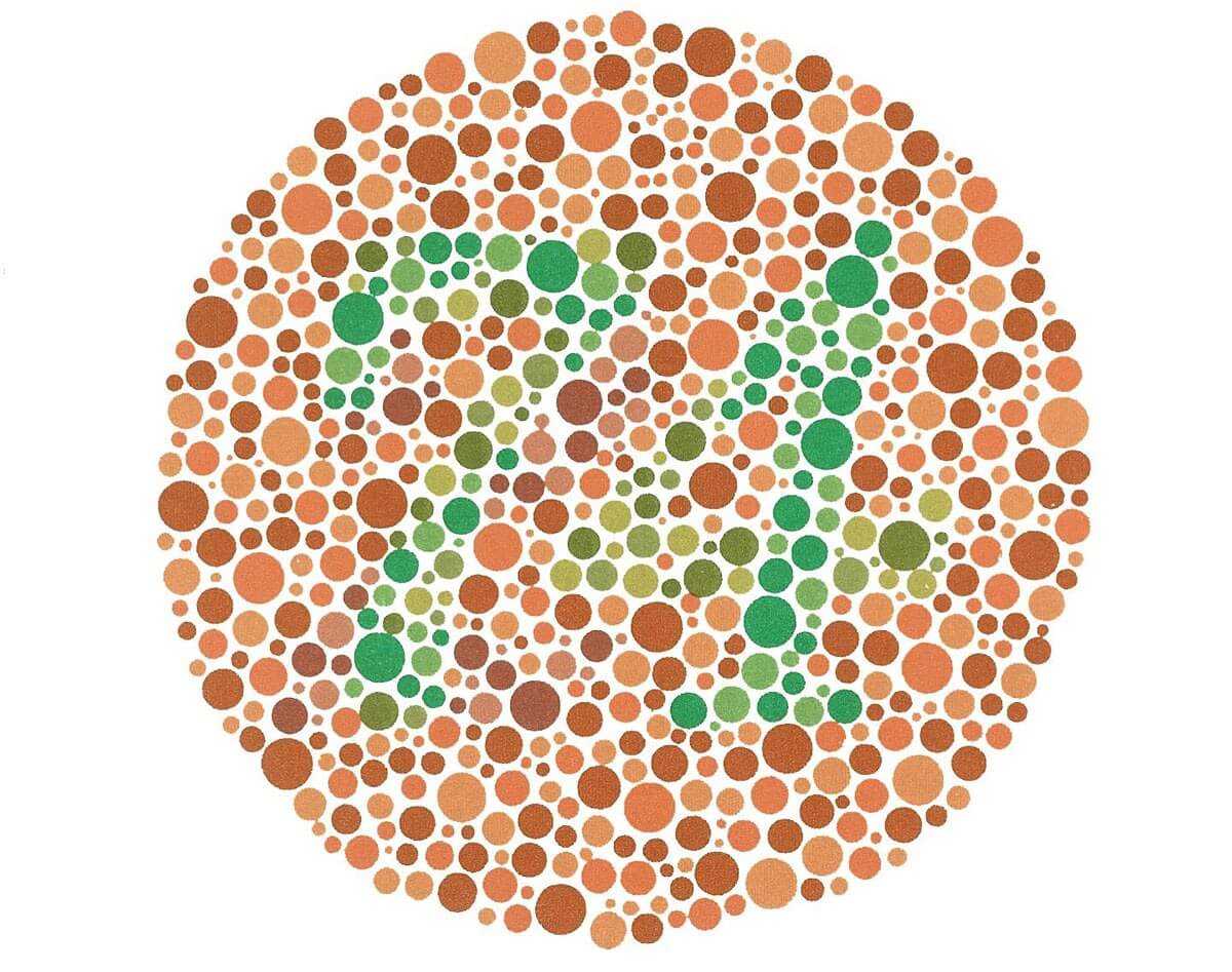
Colors are a great example — often designers pick a color to communicate a mood or a brand. If you have colorblindness, however, there’s a whole range of colors that are going to look the same to you. Designing for accessibility means thinking through which colors fall into the same range, which could leave a button to look the same as its background.
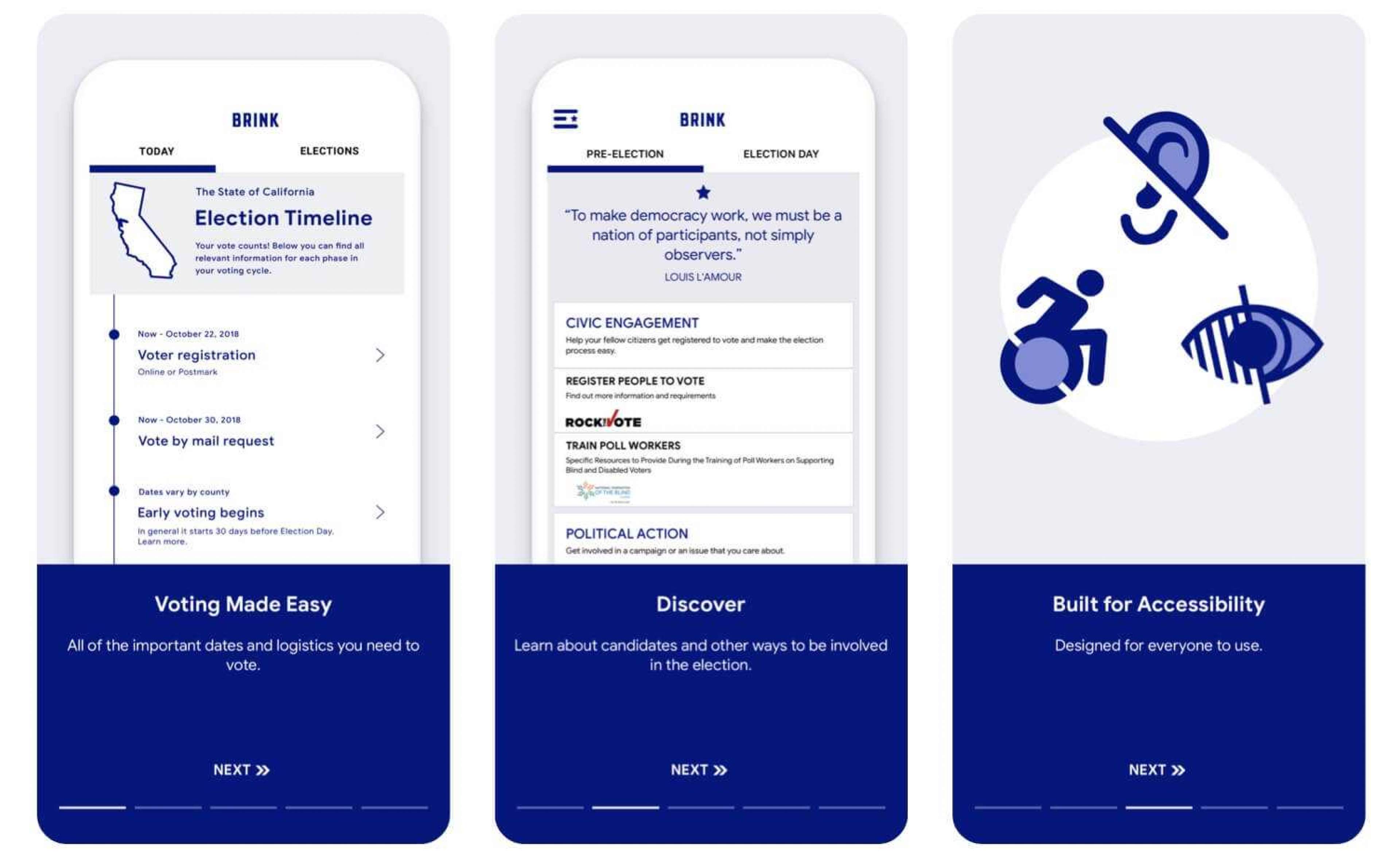
Throughout the Brink app development, we thought extensively about how the visual side of the app could work for more people. Color contrast, iconography, text — if all of these elements are used thoughtfully they can benefit more users. Some users may rely on icons — so the icons need to literally relate to what they represent. Blind and visually impaired users often use screen readers to interact with the software through an audio or braille experience, meaning that all of the UI components had to flow in a logical order without relying on visuals to convey meaning.
The new tools to help your app and site accessibility
Fortunately, there are a lot of software accessibility tools out there to help. There’s no magic code that will just make your app accessible, but there are plenty of tools that will flag the parts of the app that are noncompliant, so you can go back and figure out how to improve it.
The Web Accessibility Initiative (WAI)’s accessibility evaluation tools gave us a wide range of options, some of which are general and some of which solve specific software accessibility problems.
ESlint, a linting tool for JavaScript, can scan your code and call out common accessibility issues. Running this in the initial testing stages will keep you from making the most obvious mistakes, so you can focus your more sophisticated testing on nuanced issues.
Screen readers are one of the first software accessibility tools — not for building, but for using. Blind and visually impaired users rely on screen readers to help them make sense of the internet. Some of them read the text out-loud, others send it to a device that presents the text in Braille. So all of the visual components, such as images and buttons, need alt text that describes what it’s there for, not just what it does. Alt text that reads “button” won’t help anyone who’s reading it in Braille. We needed to make sure it says “Click here to learn more about this candidate.” Screen reader testing was something we could do on our own, letting us make sure that by the time the app got to real people, it was at least functioning as best as the screen reader would allow.
Getting the most out of accessibility testing
The biggest problem we had was figuring out whether the app was functioning the way our target users thought it should, not the way we thought it should. We don’t have anyone on staff who has the lived experience of being Deaf, for example. We can test audio cues, but we can’t know how a Deaf person would interact with a product.
Fortunately, the team behind the Brink app found a few folks that were willing to help us test what we built. Getting the software in front of the people who will benefit from these accessibility features is the only way to make sure you’re building something valuable. It’s like a chef cooking without anyone to taste the meals — you need to know what your audience thinks.
This is just the start of building accessible software
It’s already become so much easier to make accessible software, but it’s still not easy. There are a lot of hurdles, any of which can serve as an excuse for not doing something that a lot of people would benefit from.
We hope to help take down some of those barriers, and we also hope all of the tools mentioned here will keep pushing to get better. React Native is constantly updating its accessibility tools, which gives us hope.
We want accessible software to be the rule, not the exception. And the more we work it into our process, the quicker that will happen. If you want to work together on building better software, contact us.