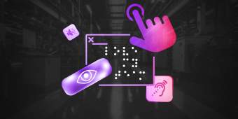
Organizations know they need elevators, ramps, wide doorways and more to make buildings accessible, yet few would pass an accessibility audit online. With far more people visiting a companies’ website than brick-and-mortar locations, it’s time to expand our ideas on inclusivity and accessibility.
JAMA, the Journal of the American Medical Association, knows the value of making sure its message reaches everyone. An inaccessible website restricts how and who you can engage. JAMA wanted to solve the problem, and picked the smartest place to start: its recruitment site.
Table XI had previously worked with JAMA on an app for virtually earning continuing medical education credits and a website to track progress toward board certifications. Each time, we got a little bit better at making accessibility a standard part of our development process. Now we had an opportunity to focus a project directly on making something easier to use for everyone.
Assessing the usability and audience needs for JAMA’s job seekers
JAMA is a large medical publishing network with more than a dozen areas of practice. Its size means it’s constantly looking to fill a lot of jobs — with more than 6,000 positions when we worked together. The sheer number of open jobs at any given time prompted JAMA to move recruitment onto its own website.
A database of that size presented a number of standard UX challenges, like simple navigation, alongside challenges specific to accessibility, like uniform structured data. The hope was that by addressing the latter, JAMA would fix the former too. An accessibility audit had the potential not just to broaden the organization’s reach and pool of applicants, but to make the job-seeking process better for everyone.
Accessibility audits as conversations
As the educational arm of the AMA and a lobbying organization for the medical industry, the JAMA team has a lot of experience putting people at the center of their work. As the technical partner on JNListen and EdHub, Table XI had a lot of experience helping JAMA reach that audience.
We were able to draw on our knowledge of JAMA’s style throughout the project, to suggest changes that felt like the brand while improving inclusivity. For example, some of JAMA’s brand colors didn’t provide enough contrast to provide easy reading online for people with visual impairments. We were able to suggest similar colors just a few hex codes away from the ones JAMA consistently uses, an almost imperceptible change that allows people with colorblindness to easily navigate the site.
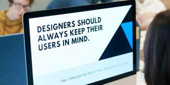
There are a lot of requirements to making an accessible site, and while it can feel restrictive to people at first, these requirements actually provide a creative design framework. By approaching it as a set of challenges instead of limitations, we’re able to find creative solutions that work for the brand and the audience.
A site auditing process to improve accessibility
To start an audit, we have to know what we’re working with. The JAMA careers site had thousands of pages, but only used a few templates to make all of them. Our first job was to identify all the types of pages that lived on the site, and their examples. Job posts, search results and blogs all followed a template, for example. Make the templates accessible, and we’d automatically make all of the pages — both past and future — accessible.
Our accessibility audit process
- Navigate the desktop site with a screen reader Screen readers help folks who can’t see websites navigate the internet by “reading” the contents of a page out loud. Anywhere we heard a misnamed link or dropped header, or found confusing navigation and focus traps, we made a note.
- Navigate the mobile site with a screen reader Fixing issues in one place doesn’t automatically mean they’re fixed everywhere. The first test will help us find things like missing alt text on images. Still, we need to run through the mobile site with the same process to make sure nothing is lost in translation.
- Use automated tools to find further issues We use automated accessibility testing tools to catch any issues we miss on our initial manual checks. A few of our favorites: - Axe: A wide range of accessibility tools for developers - Web Accessibility Evaluation Tool (Wave): A full suite of accessibility tools - Tota11y: An accessibility visualization tool that shows you how a page works with different assistive technologies No one tool is perfect, and nothing is as good as working directly with people in the disability community. Using multiple technologies helps us to catch as much as possible with automated tools.
- Manually work through the list of Web Content Accessibility Guidelines For a user, one stumbling block is all it takes to make a path impassable. To make sure we’re not leaving any obstacles in people’s way, we do a final pass ourselves. While all the tools above are great automated resources, nothing is as effective as the human eye. Some guidelines just can’t be tested with automated tools, and other things will be missed. Knowing that even a single error could keep someone from a job, we went through the WCAG framework manually to find any last issues.
Read more about the accessibility tools we use here
Making user accessibility a constant part of our practice
An accessibility audit lets us dig into existing software and find every opportunity for improving it. But it also means software has been out there in the world that hasn’t served every audience.
Our own work building custom software gives us a chance to preempt those problems. Every audit makes us smarter and more capable of making proactive decisions in the moment to prevent accessibility issues down the line.
Ideally, accessibility audits will become unnecessary — websites and software will just be built with accessibility in mind the same way they’re built with security or any other necessity in mind. We’re doing our best to make this change happen within Table XI and for our clients, writing accessibility into our core design principle of humanity.
At the end of the day, accessibility can’t be an add-on or a box organizations check to avoid lawsuits. It needs to be a positive part of the way we practice development and design, encouraging us to build more innovative, empathetic solutions.