Zach Mellender, Business Systems & Analytics Mgr.
Omaha Zoological Society

"The collaborative and positive nature was fantastic."
Zach Mellender, Business Systems & Analytics Mgr.
Omaha Zoological Society
Omaha's Henry Doorly Zoo and Aquarium was named the best US Zoo of 2023 for a reason: its exotic habitats are so immersive that it’s easy to forget you’re in Nebraska.
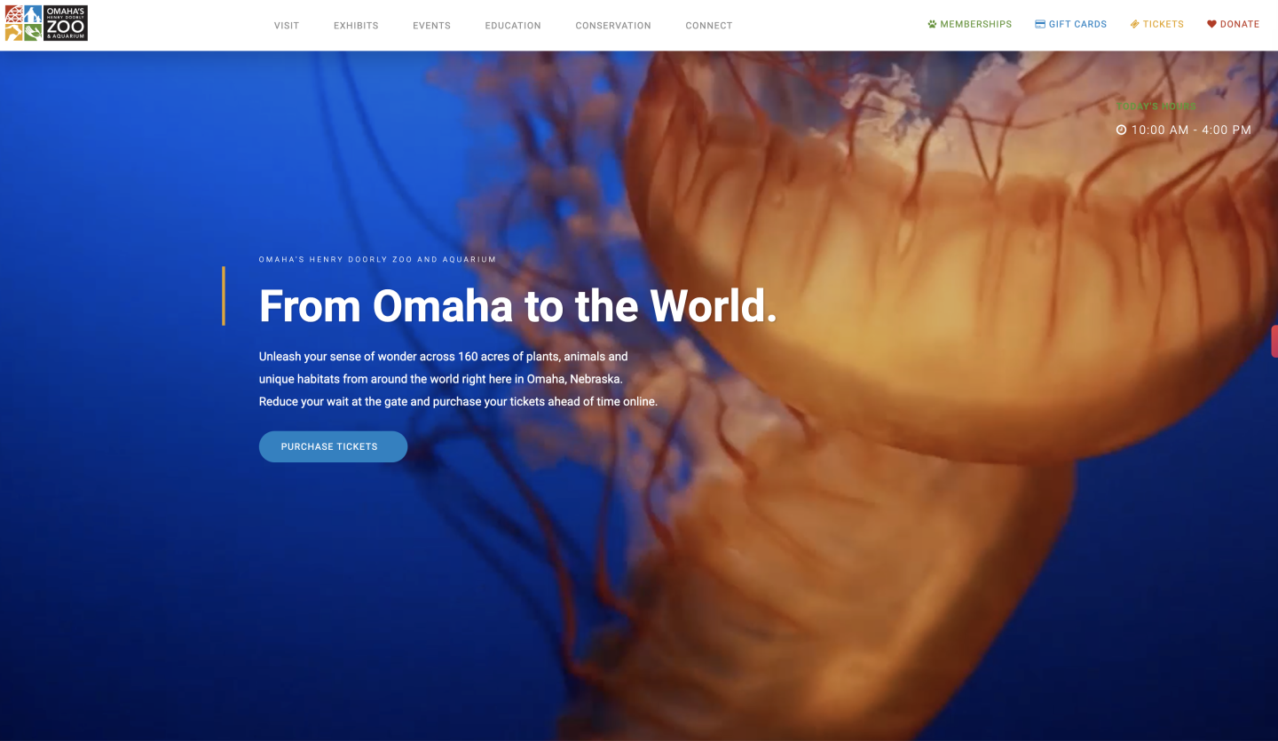
But before they reach the indoor desert or rainforest, most patrons start their visit on the Zoo’s website. It’s a crucial resource for nearly two million people each year, with self-service tools for everything from booking a summer day camp to making a donation.
Increasingly, these self-service tools left customers confused. And when people couldn’t find what they needed online, they’d call the customer service for help. The result: lots of headaches for visitors and extra work for staff—not to mention a hit to the Zoo’s bottom line.
Omaha Zoo wanted a partner to help streamline and improve its digital self-service experience. That’s when they tapped TXI.
Modernize the back end with speed to value
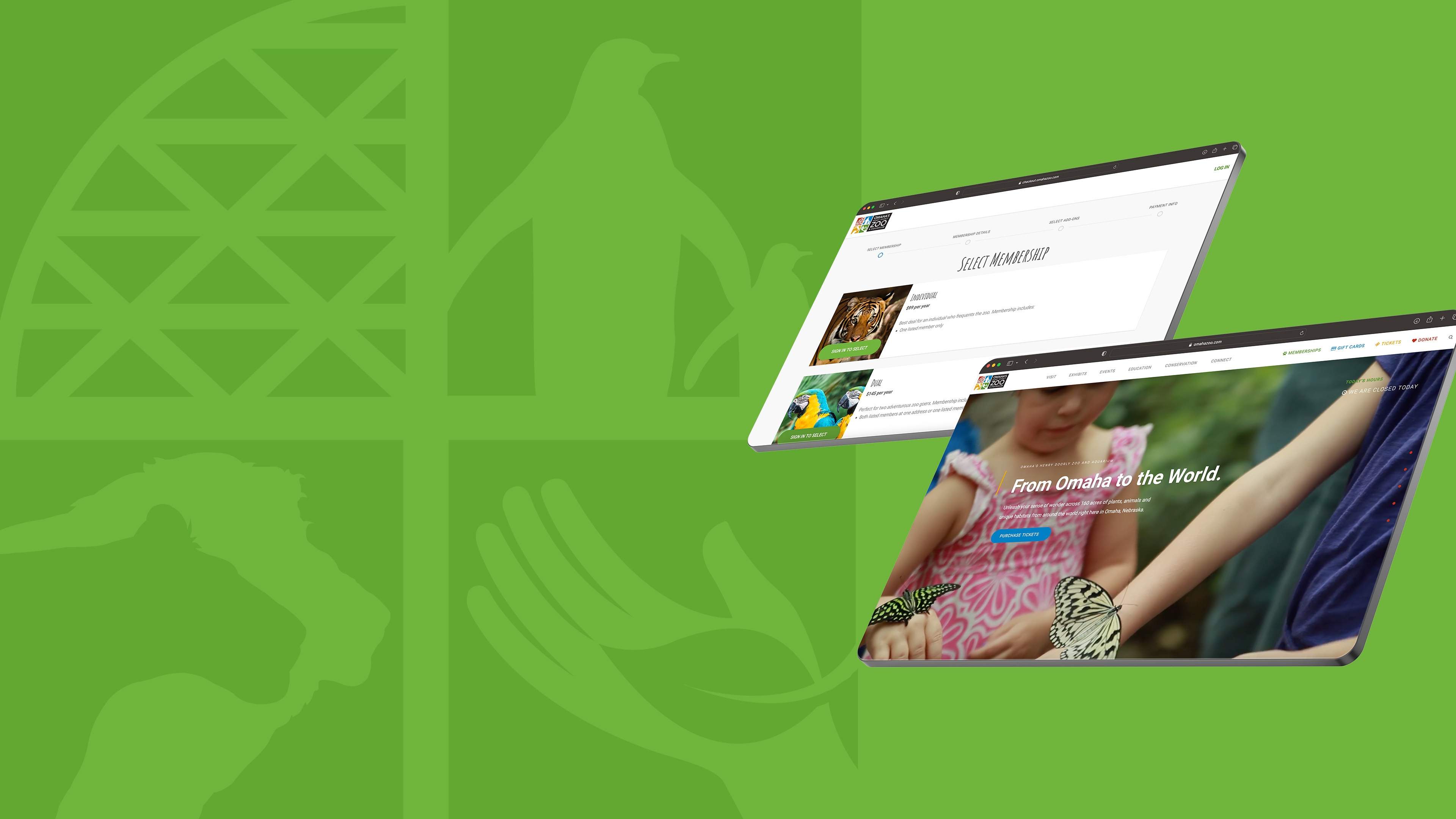
At the start of our engagement, the Zoo asked the TXI team to design and develop new user flows throughout its website. They wanted it to be easy to complete purchases online so people would choose self-service over calling the Zoo’s staff. They also wanted to eliminate the frustration people commonly experienced trying to purchase a day camp package or “adopt” an animal through the Zoo Parent program—both crucial revenue generators for the Zoo.
The problem: the site’s current infrastructure and features were underperforming. If we added to them, we risked creating more friction for everyone. Before we built anything new, we needed to identify the source of the headaches and modernize the Zoo’s existing code and infrastructure.
At the same time, we also knew that the current digital experience created a burden that employees were shouldering in real-time. For their sake, we couldn’t afford to tinker with the site for months before releasing updates.
So, we set a practical benchmark that would let us deliver the most value at the lowest possible cost —and do so in as short a timeframe as possible. We could gather user feedback, test updates, and iterate.

A code audit and a “70% rule” for infrastructure tweaks
Our first step was to conduct a code audit so we could assess the website’s existing codebase and architecture. This helped us make recommendations about what to streamline and how to triage our efforts. For example, if a code library was nearing end of life, updating that took priority. We were also able to focus on measures like…
Creating new test scripts and new tooling for CI / CD, allowing us to increase the speed of change.
Optimizing existing site features for performance and scalability.
Refactoring critical parts of the website code to allow for greater extensibility down the line.
Next, we executed infrastructure and codebase changes. A crucial guiding principle throughout: achieving 70 percent of the intended functionality was enough to significantly improve the product experience for visitors and staff.
The sooner we achieved that goal, the sooner we could offer relief to the Zoo’s overburdened team and provide users value. What’s more, we could gather initial data about the user experience in order to improve future updates.
In practice, this approach meant developing in two-week sprints obsessively focused on maximizing our speed to value. Along the way, we were transparent about…
The user-driven design options on the table.
The work we could realistically accomplish within our time and budgetary constraints.
Our step-by-step development progress (via regular demos alongside shared Notion pages, Figma files, Miro and Trello boards, etc.).
The total cost of each individual change (in terms of time and money).
Our commitment to transparency helped keep our Zoo stakeholders informed and aligned at every stage of our work. But more than that, it fostered trust over time—not just in our tactical capabilities, but also in our strategic expertise.
A user-friendly digital foundation to guide product strategy
Today, the Omaha Zoo website feels different than it did at the start of our engagement. The platform runs faster. It’s easier to buy a ticket or donate to “adopt” an animal. And the back end integrates with third-party services (such as ticketing software and Salesforce) to provide a continuous stream of user data that will inform future product changes.
Our work isn’t over, of course. But by collaborating to build a strong product foundation, we’ve set the groundwork for a long-term digital strategy focused on improving the site experience for visitors and employees. A crucial part of that strategy going forward: an emphasis on ongoing infrastructure maintenance versus costly (and painful) overhauls.
We’re excited to continue our strategic partnership with Omaha Zoo. And we’re confident in the power of digital innovation as a key value driver for years to come. If you’d like to realize that power at your organization, let’s start a conversation—we’d love to hear from you.

Find out how intelligent solutions can accelerate growth for your organization.
