Since its founding in 2006, PerkSpot has been empowering employers to deliver weekly perks to their employees. From discounted amusement park tickets to deals on electronics, restaurants, gyms, and more, these benefits have proven wildly popular.
How popular? Every month, about a million people log in to take advantage of PerkSpot deals.
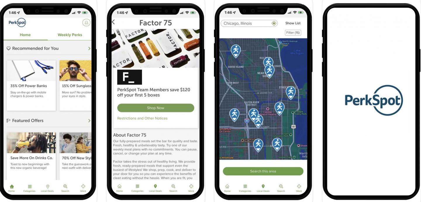
Despite the ongoing success of its core model, PerkSpot’s leaders recognized, in 2019, that without a mobile app, they were almost certainly missing out on a segment of the market.
In fact, while a million members visited the site every month, many more never logged in – and the PerkSpot team realized this was an opportunity. They suspected they could get more users to engage with their offerings via a mobile app.
The question was: how?
Specifically, what features should the app have? Should it mirror the website or offer a streamlined, mobile-optimized experience? How would PerkSpot transfer its ad-supported revenue model to an app?
The team turned to TXI for guidance.